|
|
|
 |
|
 |
| |
WPF Programmer's Reference: Table of Contents |
|
| |
|
|
 |
|
 |
|
|
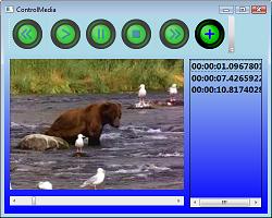
- Chapter 1: WPF Overview
-
Chapter 1 covers basic WPF concepts. It explains WPF's advantages, how WPF is layered on top of DirectX, and how WPF separates UI design from the code behind it. It also describes the different kinds of WPF projects (stand-alone, XBAP, library) and explains how Page, Frame, and PageFunction projects work in general terms.
- Chapter 2: WPF in Visual Studio
-
Chapter 2 explains how to build WPF projects with Visual Studio. It tells how to build a simple user interface and how to connect interface elements with the code behind them. This chapter explains how to set control properties and how to edit XAML code in Visual Studio. It does not explain WPF controls in great depth because they are covered in later chapters.
- Chapter 3: Expression Blend
-
Chapter 3 explains how to build WPF projects with Expression Blend. It tells how to edit XAML code in Expression Blend and how to link to Visual Studio to add code behind the user interface.
- Chapter 4: Common Properties
-
Chapter 4 describes some properties that are common to many WPF controls. These properties determine basic control features such as color, size, and position.
- Chapter 5: Content Controls
-
Chapter 5 describes WPF's controls that are intended to display content (as opposed to the controls described in the following chapters). These include such controls as Label, GroupBox, ListBox, and Image. This chapter describes the purpose of each control and summarizes its most important properties and behaviors.
- Chapter 6: Layout Controls
-
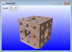 Chapter 6 describes WPF's controls that are intended to arrange other controls. These include such controls as Grid, DockPanel, StackPanel, and WrapPanel. This chapter describes the purpose of each control and summarizes its most important properties and behaviors.
- Chapter 7: User Interaction Controls
-
Chapter 7 describes WPF's controls that are intended to allow the user to control the application. These include such controls as Button, RadioButton, TextBox, and Slider. This chapter describes the purpose of each control and summarizes its most important properties and behaviors.
- Chapter 8: Two-Dimensional Drawing Controls
-
Chapter 8 describes WPF objects that perform two-dimensional (2D) drawing. These include Line, Ellipse, Rectangle, Polygon, Polyline, and Path. This chapter also explains the Path mini-language and geometries, which can contain multiple drawing objects.
- Chapter 9: Properties
-
Chapter 9 explains WPF properties in detail. Whereas the earlier chapters use properties to provide simple examples, this chapter describes properties in greater depth. It explains basic properties entered as simple text, properties that can be entered as multiple text values, properties that are objects, dependency properties, and attached properties.
- Chapter 10: Pens and Brushes
-
Chapter 10 describes the pen and brush objects that you can use to determine the graphical appearance of WPF objects. In addition to simple single-color pens and brushes, this chapter describes more complex objects such as dashed pens, gradient brushes, and image brushes.
- Chapter 11: Events and Code-Behind
-
 Chapter 11 explains routed events, tunneling (preview) events, bubbling events, and attached events. These different kinds of events allow you to attach a user interface that was created with WPF to the code behind the scenes.
- Chapter 12: Resources
-
Chapter 12 explains WPF resources. It tells how to use static and dynamic resources in XAML code.
- Chapter 13: Styles and Property Triggers
-
Chapter 13 explains styles and property triggers. It tells how to use styles, usually stored as resources, to give objects a consistent appearance. (For an example, see Figure I-4.) It also explains property triggers, which are often defined in styles, to change a control's appearance when a property value changes.
- Chapter 14: Event Triggers and Animation
-
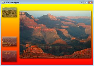
Chapter 14 explains event triggers and the animations they can run. It explains storyboards and timelines that let WPF applications perform animations with surprisingly little effort.
- Chapter 15: Templates
-
Chapter 15 describes control templates. It explains how you can use templates to change the appearance and behavior of predefined controls. It also tells how to use ItemsPresenter and ContentPresenter objects to change the way lists and menus work.
- Chapter 16: Themes and Skins
-
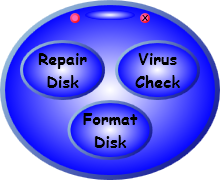 Chapter 16 explains how to use resource dictionaries to provide application themes and skins. By changing a single resource dictionary, you can make a WPF application change the appearance of some or all of its graphical components.
- Chapter 17: Printing
-
Chapter 17 explains how a WPF application can display print previews and how it can print documents.
- Chapter 18: Data Binding
-
Chapter 18 explains how to bind control properties to data. It explains basic data binding and also shows how to use DataTemplate objects to provide more complicated data display.
- Chapter 19: Commanding
-
Chapter 19 explains commanding, a tool that lets you associate controls to command objects that represent the actions they should perform. For standard operations such as copy, cut, and paste, these objects make providing consistent features much easier.
- Chapter 20: Transformations and Effects
-
Chapter 20 explains rotation, scaling, and other transformations that you can use to rotate, stretch, and otherwise change the appearance of WPF objects. It also describes special graphical effects such as blur, drop shadow, and glow. (For examples of drop shadow, see Figure I-3.)
- Chapter 21: Documents
-
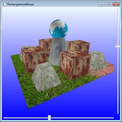 Chapter 21 explains the document objects provided by WPF. It explains fixed documents, which display items in the precise positions where you place them, and flow documents, which can rearrange objects much as a web browser does to take advantage of the available space. (For an example, see Figure I-9.)
- Chapter 22: Navigation-Based Applications
-
Chapter 22 describes programs that use special navigation controls to manage how the user moves through the application. It explains how to build Page, Frame, and PageFunction projects.
- Chapter 23: Three-Dimensional Drawing
-
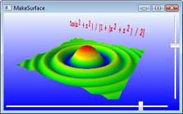
Chapter 23 explains how to display and control 3D drawings in WPF. Although it is possible to build these objects in XAML code, it is often easier to generate 3D scenes programmatically, so this chapter provides both XAML examples and examples that use C# code to build scenes.
- Appendix A: Common Properties
-
Appendix A summarizes properties that are shared by many WPF controls.
- Appendix B: Content Controls
-
Appendix B summarizes the most useful properties and behaviors of WPF controls that are intended to display content such as Label, ListBox, and Image.
- Appendix C: Layout Controls
-
Appendix C summarizes the most useful properties and behaviors of WPF controls that are intended to contain and arrange other controls such as Grid, StackPanel, and WrapPanel.
- Appendix D: User Interaction Controls
-
Appendix D summarizes the most useful properties and behaviors of WPF controls that let the user control the application such as Button, RadioButton, and TextBox.
- Appendix E: MediaElement Control
-
 Appendix E summarizes the MediaElement control.
- Appendix F: Pens
-
Appendix F summarizes Pen classes and properties that an application can use to determine the graphical appearance of line features.
- Appendix G: Brushes
-
Appendix G summarizes Brush classes and properties that an application can use to determine the graphical appearance of filled areas.
- Appendix H: Path Mini-Language
-
Appendix H summarizes the Path mini-language that you can use to draw shapes with the Path object. Complicated paths are much easier to build with the Path mini-language rather than using objects contained inside a Path.
- Appendix I: XPath
-
Appendix I summarizes the XPath expressions that you can use to bind XML data to WPF controls.
- Appendix J: Data Binding
-
Appendix J summarizes data binding techniques you can use to bind property values to values provided by different objects such as other WPF controls or objects created by code-behind.
- Appendix K: Commanding Classes
-
 Appendix K summarizes the most useful predefined commanding classes.
- Appendix L: BitmapEffects
-
Appendix L provides an example demonstrating the different BitmapEffect classes.
- Appendix M: Styles
-
Appendix M summarizes the syntax for creating named and unnamed styles.
- Appendix N: Templates
-
Appendix N provides example templates for the Label, CheckBox, RadioButton, ProgressBar, ScrollBar, and Button controls.
- Appendix O: Triggers and Animation
-
Appendix O summarizes the syntax for creating event triggers and the animations that they control.
- Appendix P: Index of Example Programs
-
Appendix P lists this book's more than 250 example programs, all of which are available for download on the book's web site in C# and Visual Basic versions. It gives a brief description of each program, tells where it is shown in a figure (if it is), and tells which page has more information. You can use this list to find examples that may help with specific problems.
|
 |
|
 |
| |
WPF Programmer's Reference: Table of Contents |
|
| |
|
|
 |
|
 |
|
|
